There is a primary cause of natural resource degradation in our throwaway society, and we need to act to fix it.

Company: Biokos is a fictitious company that I created for the exercise.
Business type: Recycling application
Project type: Technical test for onboarding process. It took 3 weeks to complete the exercise. (2022)
Role: UX UI Designer - Research
To order my process, I used the design thinking framework.
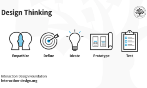
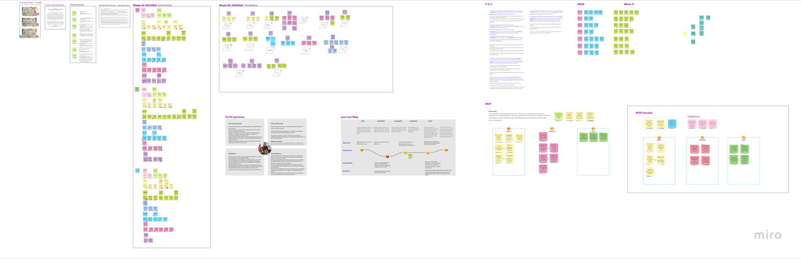
During the empathize phase ,I started with “Crazy 8” method to define the users and after that I designed the interview for the users. I conducted the interview for 3 potencial users. To define a User Persona, I did different POV (points of view), Empathy Map, and HMW (How Might We).You can know more about the process by clicking on the image

Tatiana
25 years old
Lives in: Buenos Aires - Argentina
Family: Boyfriend and a cat
Profession: QA in Accenture
Tatiana works from home, her favourite transportation is her bike She was able to convince her family to separate their waste.
Tatiana is a vegetarian and wants to be a vegan in the future. She organized a campaign in her building for the correct separation of waste and collected clothes and toys for the needy schools in her city.
Leaving litter on the streets and not taking responsibility for it. Lack of responsibility and awareness of environmental issues. It is difficult for her to influence people because she does not know how to do it. The recycling centers' schedules don't always coincide with hers.
“There are consequences to every action we take”
“The changes would be simpler if they were collective, but starting at home and with small actions every day is the key"
Practicing some of the 3Rs (Reduce, Recyle, and Reuse) could help to significantly reduce everyday waste. At least one third of it.
Many people fail to recycle because they do not know how to separate waste, where the recycling points are located, and when they are open.
Tatiana is very conscious of the environment and responsible for it. Because she has little time and is often busy during those hours, she needs to be able to access recycling points without depending on limited hours or proximity.
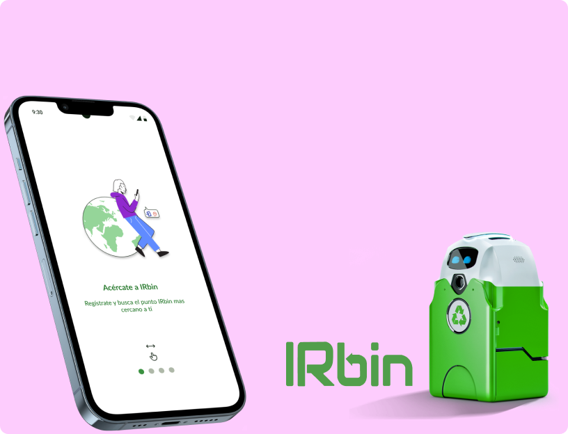
The design of an application that connects recycling centers and people who are recycling or repairing, creating a network and community. After this MVP I prioritized the needs to create the MosCoW method and started with the ideation phase
You can know more about the process by clicking in this link
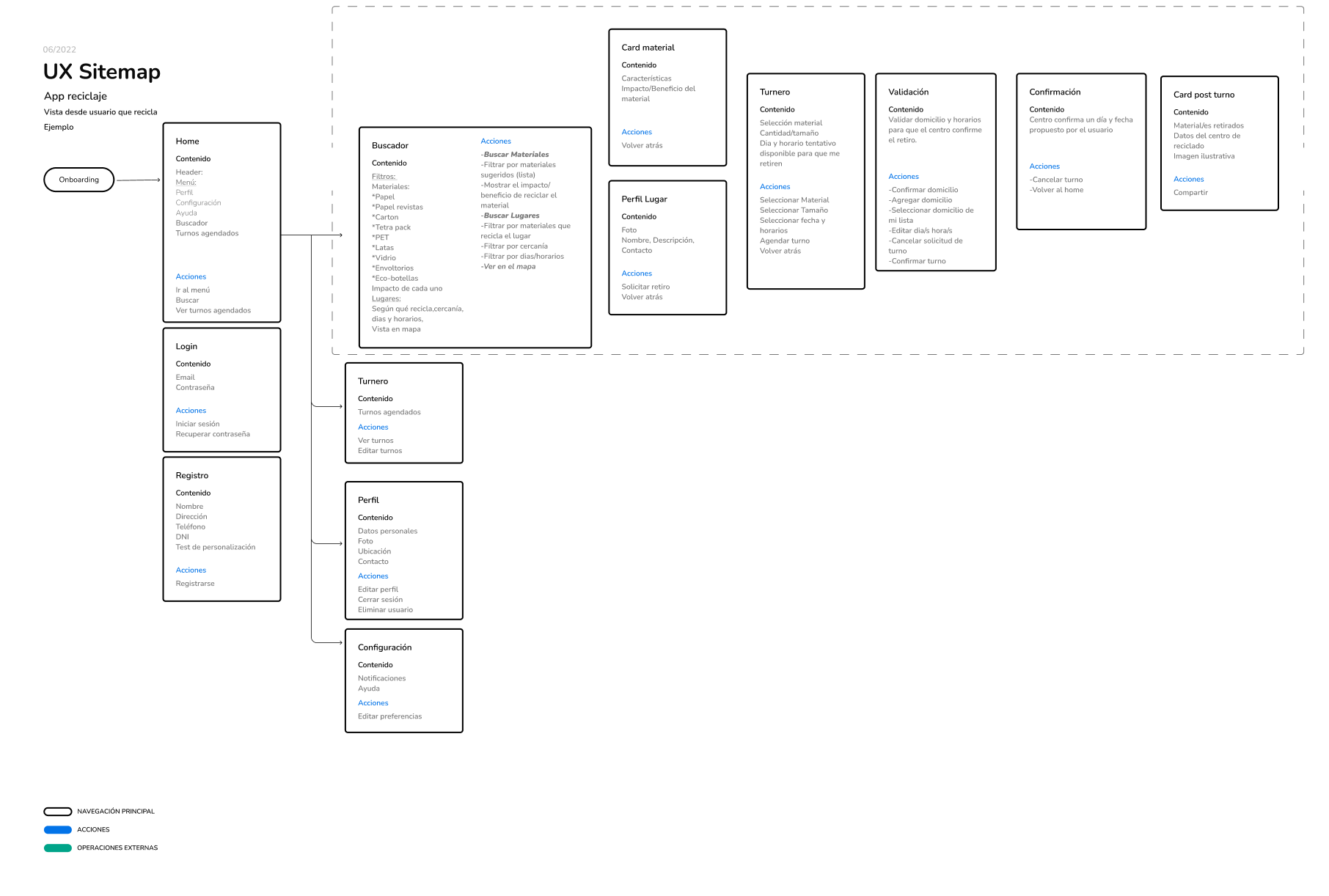
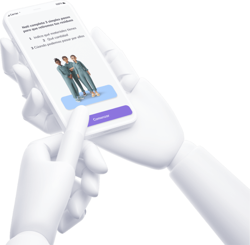
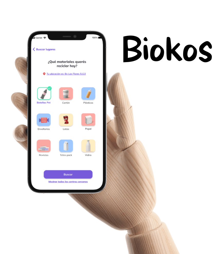
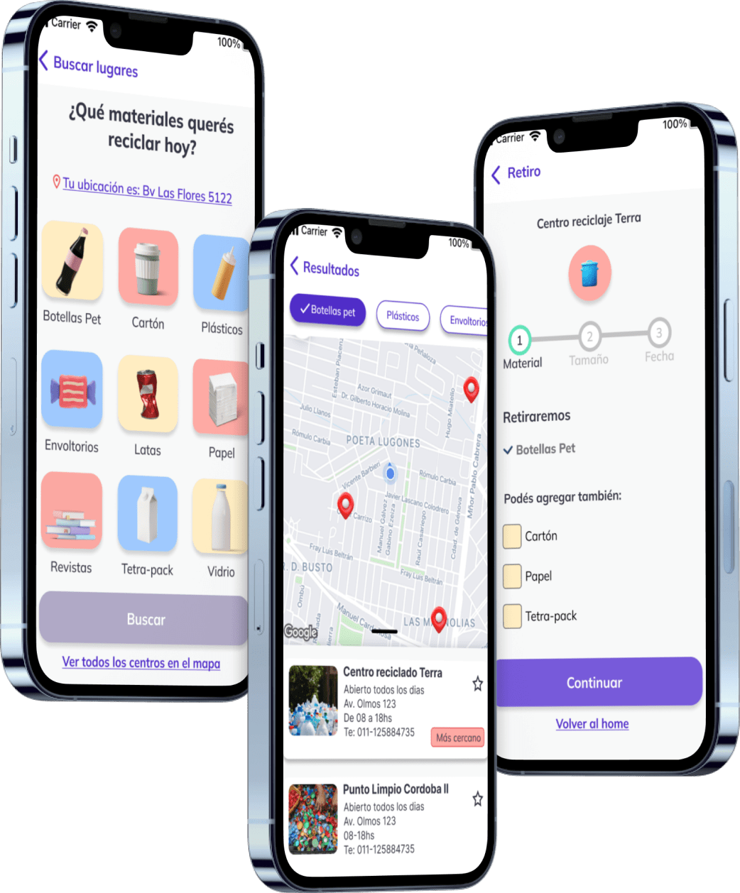
Due to the limited exercise time, I prioritized two main tasks for the user: finding a recycling center and scheduling a waste and material pickup.
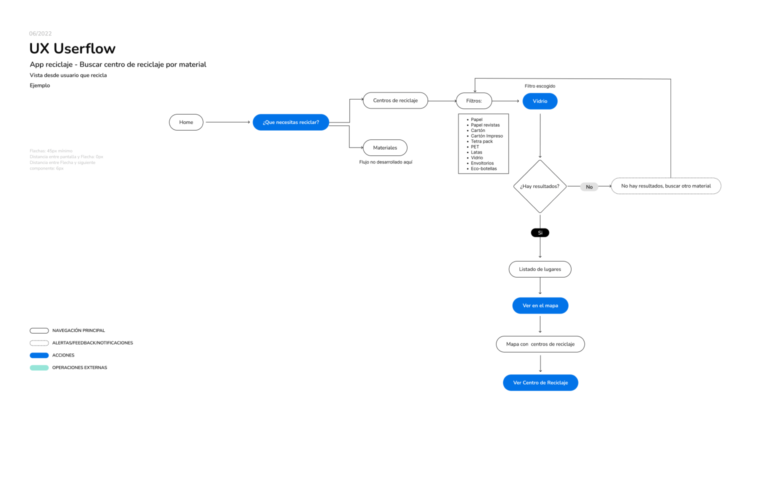
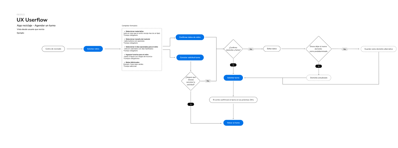
As part of this phase, I focused on how to display the flows on screens so that users could test the main tasks.
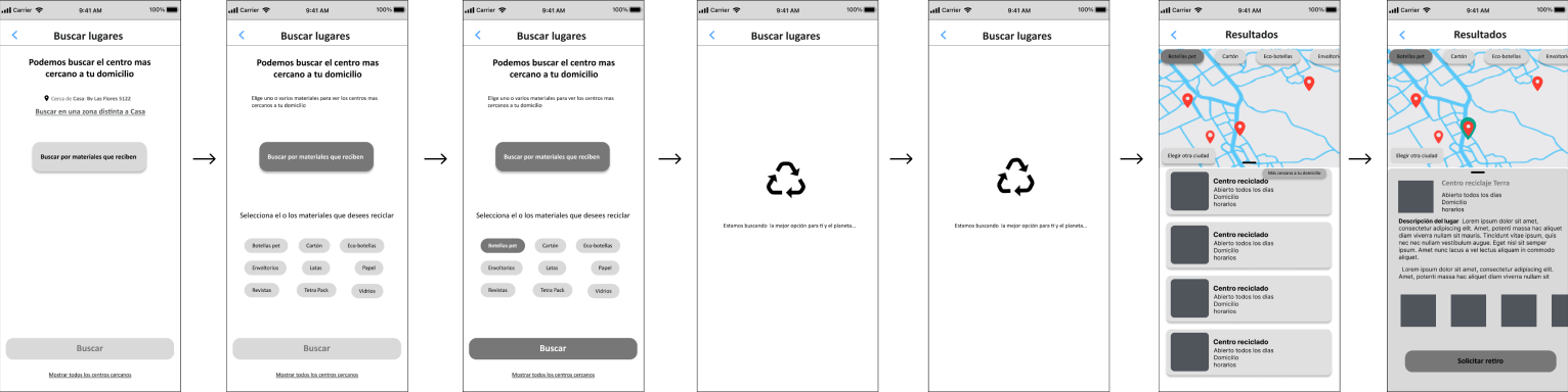
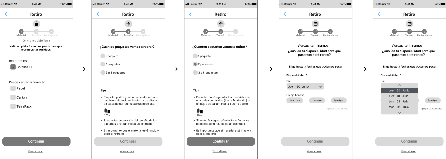
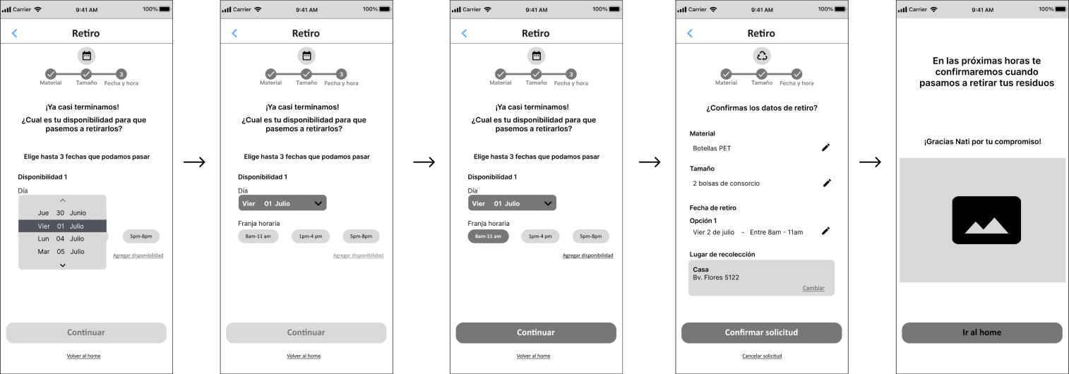
Through a usability test with 3 users, the hypotheses of the proposed flows for searching materials, choosing the recycling center were validated. It was also found that the users understand that the center can recycle more than one material, how much a material can measure, dates, and confirmation of the appointment. The tasks were completed by all 3 users, but adjustments were made to the interface to make it clear that only one option is possible when selecting pickup. Showing more information to identify materials remains pending. Booking an appointment did not present any difficulties.
The case was a very thorough way of doing research and sorting information to start the ideation stage, and I learned a lot from it.
Users were confused by the absence of an input menu for these options, even though the flows were correct.