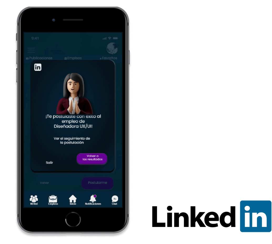

There are now 727 million active LinkedIn users worldwide. Globally, it is the most popular social network for work purposes. Companies, candidates, and recruiters can connect on one of the world's most popular social networks for employment purposes. Recruiters can find resources and share information and training.As a result of the pandemic, home workers have become more common; contacts in the virtual world are now an everyday occurrence.Newspaper ads are no longer the only way to find a job.
Company: LinkedIn
Business type: Professional Social Network
Project type: Advanced UX UI training case study
Time: 2 months (2021)
Role: UX UI Designer - Research - Animations
As part of a UX/UI capability, I chose the Linkedin redesign. Even though I'm improving my UI skills now, I did a lot of research for this project and learned a lot about the different methodologies and tools for interaction design.
I worked with Design Thinking process and the 5 UX Elements by James Garret:

Easy personal profile completion, personalized job search and customization of information will allow an intuitive understanding of the application and enable recruiters to quickly reach their candidates.
Number of new users
100% complete profiles
New layout and new features development Marketing and advertising.
To validate my hypothesis about the application's problems and how the users feel about it, I did some interviews.
3 out of 5 interviewees primarily use LinkedIn on their mobile devices. *In any case, access from the pc does occur, although less frequently.
2 out of 5 interviewees receive too many notifications that are of no interest to them.
3 out of 5 interviewees use LinkedIn as their main source of job search.
4 out of 5 interviewees use LinkedIn to see their contacts' posts *Sometimes the content is not interesting to them and they would like to classify such a content.
“How do others see my profile?”
“I feel like I'm not taking advantage of all the features”.
“Less notifications, not everything that reaches me interests me.” (app user, 27 years old)
Not knowing what you applied for and the status of your applications.

Alma
26 years old
Graphic and UX/Ui Designer
Alma has been thinking about a job change for some time and today she decided to start the search.She downloaded the LinkedIn app to start the process (she already had an account).
To find a job that she likes and allows her to grow. To be able to apply and/or contact people who can offer her different proposals according to her profile.
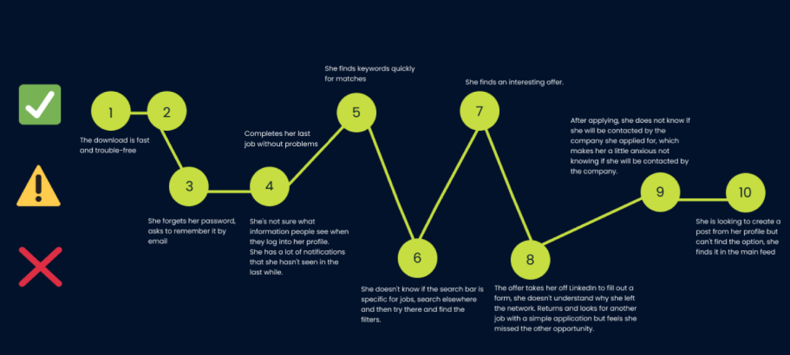
-Search
-Notification
-Tracking
-Preferences
-Expectation
-Centralization
-Process
The challenge consists in standing out in a more natural and simple way in a network that is growing every day. Users should feel that they are not wasting time trying to apply, to understand the dynamics and have more certainty in a job search in an increasingly competitive world. Reconsider the "Premium" and see it as an investment can be a business opportunity. Make the millions of people who use the network find what they were looking for.
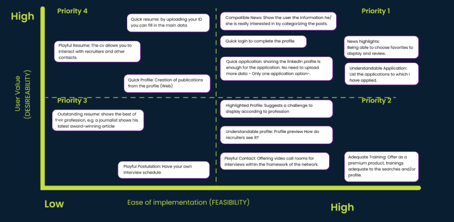
In a first instance of solution, a new information architecture was proposed. A closed cardsorting was made with the new sections to be included in the new redesign stage.
There were 4 main sections: Tab bar, Hamburger menu, Feed, Jobs.
Things did not go as well as I expected but after analyzing the results of the tree testing, I adjusted the information architecture.
Here you can find the differents studies in Optimal workshop:
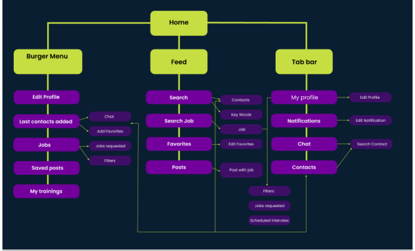
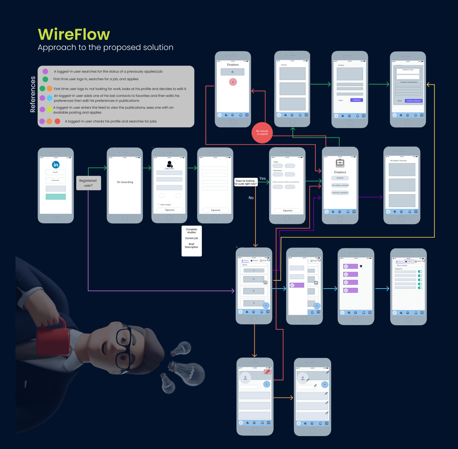
-Register - Onboarding
-Job search settings
-Job Application
-Feed and new contacts
All application processes should be completed on LinkedIn, including tracking the status of the application. The importance of filtering information is equal to the importance of a search bar. When applying, people value complete application information.
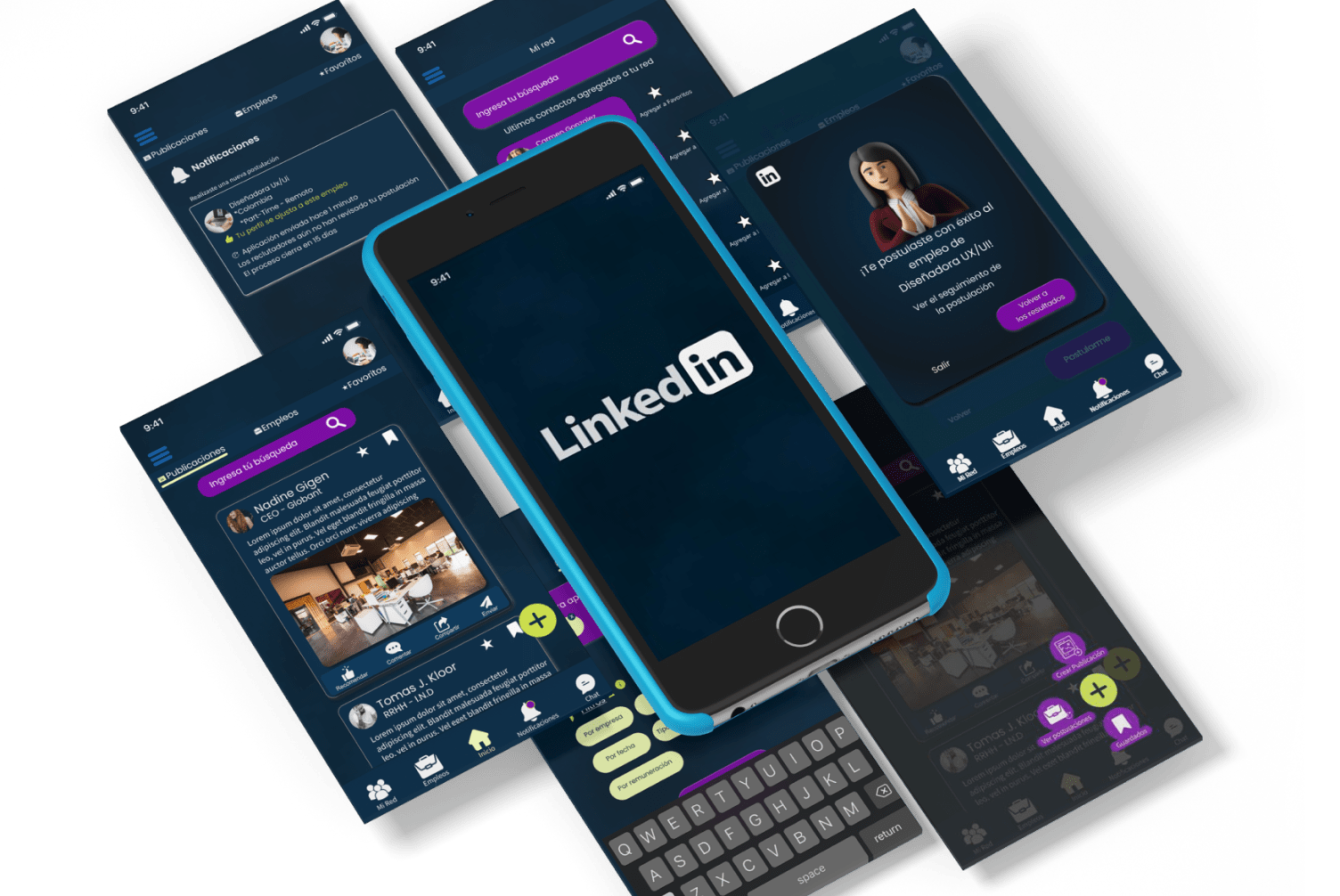
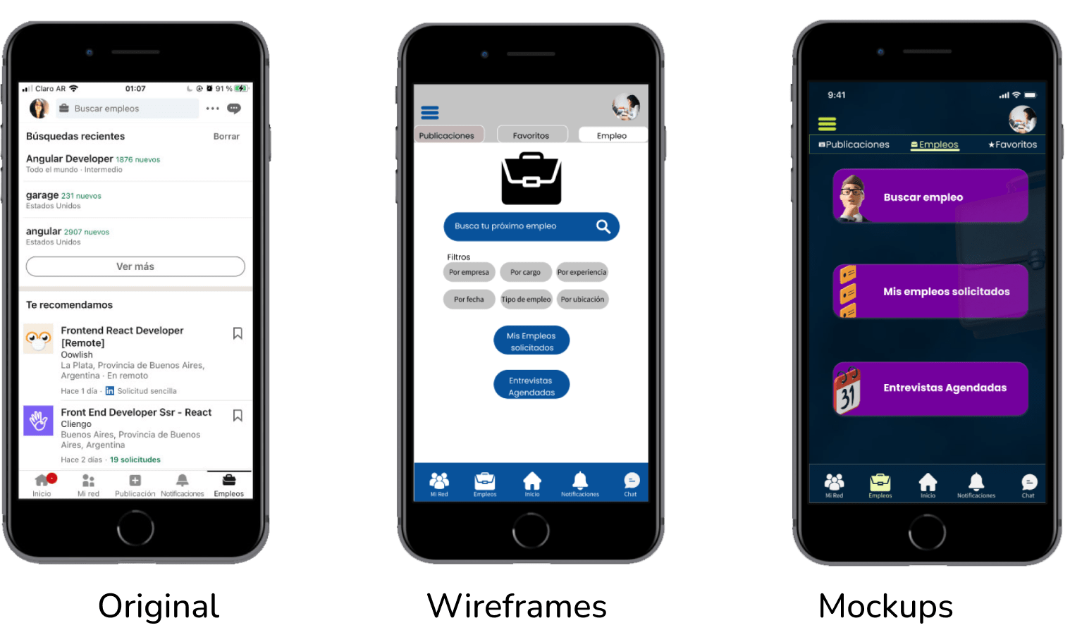

All application processes should be completed on LinkedIn, including tracking the status of the application. The importance of filtering information is equal to the importance of a search bar. When applying, people value complete application information.
Is there anything I can do differently?Of Course! I replaced some screens used for testing the application, which resulted in my losing the process register, so I don't have any evidence of evolution. As this exercise had a limited time limit, I couldn't do more iterations. UI needs to be improved (definitely).